Well, hello! I’m Alyssa, Senior Designer here at Screenfeed. This is my first post on the Digital Signage Content Blog and I’m so excited to let you in on some color knowledge! Give it a read—it’s much easier than color theory class.
Having the freedom to customize your Screenfeed or other third-party content is amazing. It allows you to have fresh, well-designed content that aligns with your brand or flexes for a specific event or promotion. But with great power, comes great responsibility. A color palette can really make or break your viewer’s experience. If done poorly, it can devalue your brand, reduce readability, and even cause eyestrain. But that’s why we’re here. I’ll break down the ol’ color wheel and the relationships that define color to help you build successful palettes. But first, a note on the colors themselves. We’ve got our primary colors; red, yellow, and, blue; our secondary colors; orange, green, and violet; and the tertiary colors; red-violet, blue-violet, blue-green, yellow-green, yellow-orange, and red-orange—sorry, no maroon, mauve, or robin’s egg blue here! From there, it’s really just the mixing of these colors, or hues, that create all other colors.

“Color relationship” is just a fancy way of describing how colors interact and what emotions they can elicit. Remember the color wheel from grade school? Everything stems from how you group those colors. Using one of these groups is a great way to start your palette. From there, you can shift a color one way, brighten it up, tone it down, and so on to customize it or fit your brand.

Simply, two colors directly across from each other on the color wheel (i.e. red and green, yellow and violet, blue and orange). These colors offer the most contrast as they are complete opposites of each other. You’ll see lots of sports logos using this scheme for that very reason.
Side note, if you were to mix them, you’d end up with brown or gray. Not that you would, but hey, color is fun ;)

Three colors next to each other on the color wheel (i.e. red, red-orange, yellow; blue-green, blue, blue-violet). These colors feel softer and are more cohesive, which make them work well for corporate brands such as hospitals or banks.

Choose a color, then add tints and/or shades. But wait a minute, what are tints and shades?! Add white to a hue—you have a tint, add black—you have a shade. Similar to analogous, this is a good option for large brands and is a safe bet when choosing a palette, especially for digital signage content.
Tip: Add white to a hue—you have a tint, add black—you have a shade.
The next schemes are less common, but offer a great way to expand upon the usual palettes.

Let’s mix it up! A triad just means three colors that form an equilateral triangle on the color wheel, such as red, blue, yellow (hello, primary colors!); orange, green, violet; or yellow-green, red-orange, and blue-violet.

Start with a complementary relationship, then use the two hues on either side of one of the colors. For example, yellow and violet are complementary. The two colors on either side of violet are blue-violet and red-violet. This leaves yellow, blue-violet, and red-violet. Bam, split-complementary!

Now if I’ve got your head spinning with color theory, don’t worry. There’s an easier option. I mention this in the video above too. There are tons of free color palette resources on the internet like Adobe Color, Adobe Capture, Colormind, Canva Palette Generator, Paletton, Color Hunt, ColorSpace, just to name a few. Any of these can help you choose a palette to customize your digital signage content. Adobe Color is my go-to because it’s really easy to use and you can browse through thousands of successful palettes, save your favorites, and create your own palettes based on a single color. This is a great way to create a palette starting with a brand color.

Adobe Color CC can make short work of generating color matches for key colors in your network...AND - it's FREE!
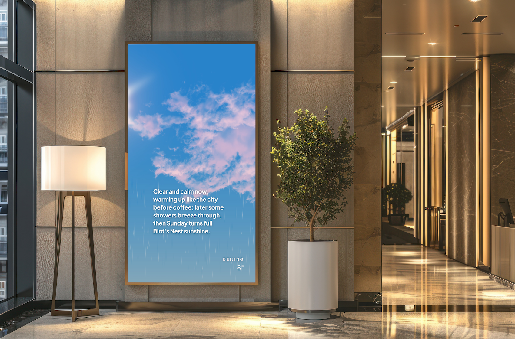
Adobe Capture is another app I like to use. You can simply take a picture with your phone and it will build a palette from that image. For example, a pic of that beautiful sunset from last night can become a palette you can use on your next Spectrum or News Graphics feed.
Obviously this just scratches the surface of color, but hopefully you’re better outfitted with the knowledge to easily build your own color palettes and to customize your digital signage content like a pro.
Thanks for reading - hope to catch you with our next post. In the meantime, tweet us with a pic of your best palettes (or palettes gone wrong!) ‘Til next time! 👋🏻